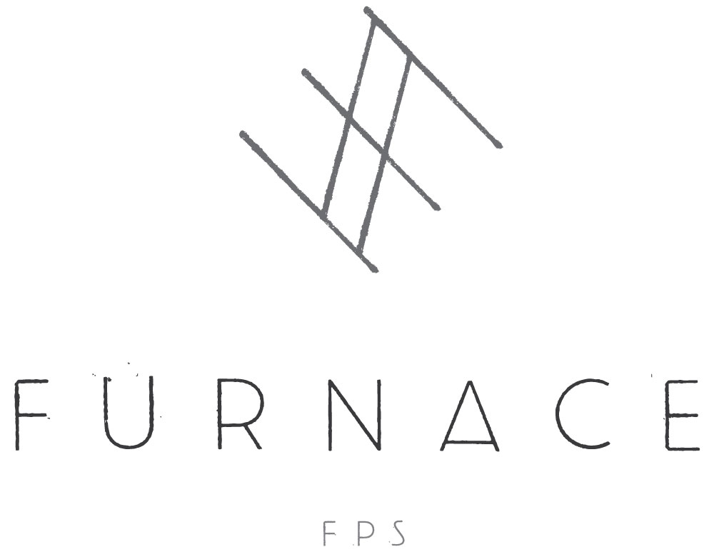
Minimal, clever, and clean (with just a bit of grit). These are some of the words that Skirven & Croft helped us define during the design process. And boy did they nail it.
Skirven & Croft’s work had been catching our eye for a while now and we knew it would be good fit once we were ready for a new logo. At Furnace FPS, we have our own process for figuring out what our clients’ needs, likes, and goals are so it was interesting being on the opposite end of the designer/client relationship. Tim & Ali were great the whole way through, their approach helped us articulate what we needed and wanted. Through questionnaires, moodboards, and logo concepting/iteration we landed on what you see above.
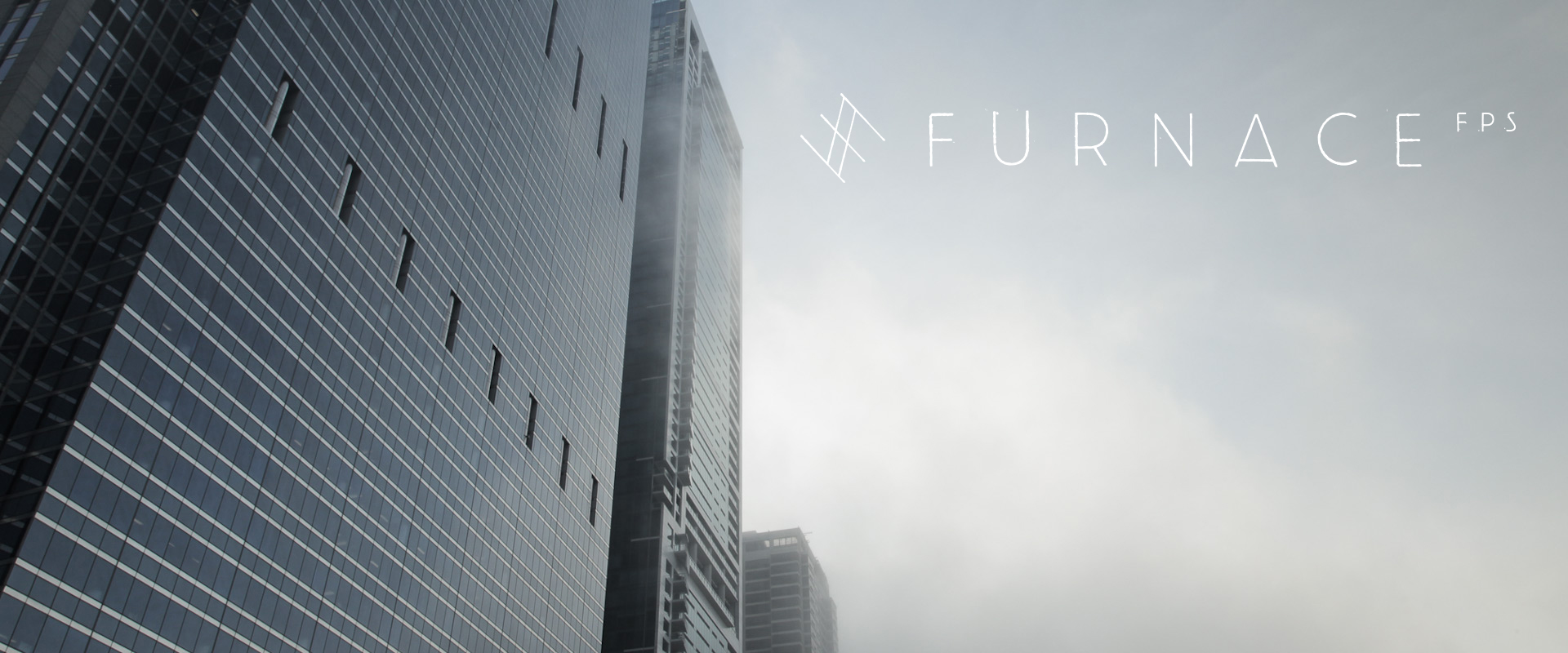
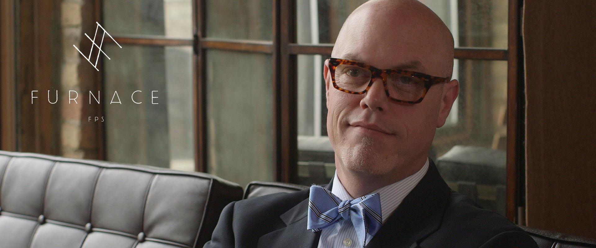
On top of being a perfect match for our design sensibilities, this new logo represents the Furnace frame of mind and how we approach our work. It’s strong yet accessible. It’s minimal yet clever. It’s clean yet gritty. The monogram not only serves as recognizable mark for Furnace but it sits softly above our name, providing a strong backbone and the lightest of visual movement.
Aside from the symbolic, the logo had to meet a few logistical needs as well. Because we’re a production company, we wanted the logo to work well when overlaid over footage without feeling overbearing. It had to be subtle yet recognizable, on top of our images to provide balance.
If you can’t tell, we’re pretty happy with our new logo. Now that it’s here, we can’t wait to use it. Plus, just think how much fun it will be to animate and drop into our new reel (coming soon)! And if you haven’t left the site to check out S&C’s work yet, head over to their Instagram to see all the fun stuff you’re missing out on.
![]()